
Selecting the right font for your outdoor house numbers is a crucial decision that affects both the aesthetics and functionality of your home’s exterior. Clear, easy-to-read fonts ensure that your house numbers are visible from a distance, which is essential for visitors, delivery personnel, and emergency responders. With countless font options available, it’s important to understand which fonts offer the best legibility for outdoor use. This article explores the easiest fonts to read on outdoor modern house numbers, key factors influencing readability, and tips for choosing fonts that enhance both style and visibility.
Why Font Readability Matters for Outdoor House Numbers
Outdoor house numbers serve a vital practical purpose: they guide people to your home. When fonts are difficult to read, it can cause confusion, delays, and even safety risks. Some of the reasons font readability is important include:
- Safety: Clear house numbers help emergency responders locate your home quickly during emergencies.
- Convenience: Visitors and delivery drivers can find your address without hesitation.
- Curb Appeal: Well-chosen fonts enhance your home’s exterior design while ensuring functional visibility.
To fulfill these roles, fonts must be legible from various distances, withstand outdoor conditions, and maintain clarity in different lighting environments.
Key Characteristics of Readable Fonts for Outdoor House Numbers
When choosing fonts for outdoor house numbers, several characteristics influence readability:
1. Simplicity and Clean Lines
Fonts with simple, clean lines and minimal decoration avoid visual clutter. Sans-serif fonts, which lack extra strokes at the ends of letters, are generally more readable from a distance.
2. Clear, Distinct Numerals
Each digit should be easily distinguishable to avoid confusion between numbers like 1 and 7 or 0 and 8. Fonts with well-defined shapes improve quick recognition.
3. Adequate Thickness
Fonts with sufficient weight or thickness are easier to read, especially in low-light conditions. Thin fonts can become difficult to see outdoors.
4. Proper Spacing
Adequate spacing between digits prevents numbers from appearing crowded or merging, enhancing legibility.
5. Balanced Proportions
Fonts with balanced height and width proportions maintain clear readability without distortion.
The Easiest Fonts to Read on Outdoor House Numbers
Based on these principles, here are some of the most legible and popular fonts for outdoor house numbers:
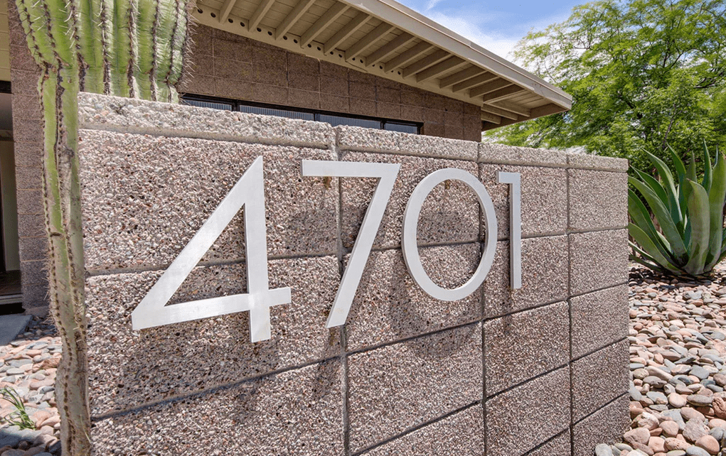
1. Helvetica
Helvetica is a timeless sans-serif font known for its clean, neutral appearance. Its simple geometric forms provide excellent clarity and make it a versatile choice for any home style.
2. Arial
Arial, another popular sans-serif font, offers great readability due to its straightforward design. It performs well in various sizes and lighting conditions, making it a practical option for outdoor use.
3. Futura
Futura features a geometric design with sharp lines and clear shapes. Its balanced proportions and bold strokes enhance visibility, especially from a distance.
4. Gotham
Gotham is a bold, professional font often used in signage and branding. Its strong presence and legible letterforms make it ideal for large house numbers where visibility is critical.
5. DIN
DIN fonts were originally designed for industrial applications, emphasizing clarity and precision. Their clean and technical style translates well to house numbers, providing outstanding legibility.
6. Verdana
Verdana was specifically created for screen readability but works well outdoors too. Its wide letter spacing and simple shapes improve visibility, especially for smaller-sized numbers.
Fonts to Avoid for Outdoor House Numbers
While decorative fonts can be appealing, some styles are unsuitable for house numbers due to poor readability:
- Script Fonts: These fonts mimic handwriting and are often too intricate to read quickly from a distance.
- Ornate or Decorative Fonts: Excess flourishes and complex designs hinder legibility.
- Thin or Light Fonts: Lack of thickness can cause numbers to blend into the background or become hard to see under certain lighting.
Tips for Enhancing the Readability of Outdoor House Numbers
Beyond font selection, other factors contribute significantly to the legibility of your house numbers:
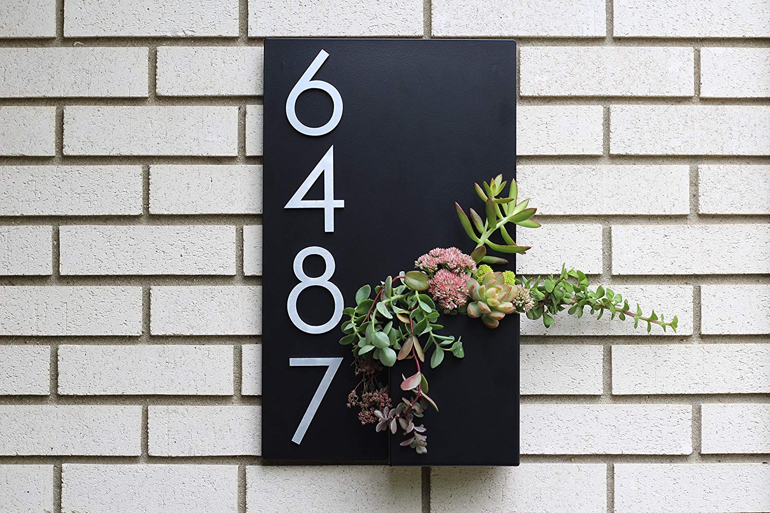
Color Contrast
Choose colors that sharply contrast with your home’s exterior. For example, white numbers on a dark wall or black numbers on a light wall enhance visibility.
Size and Scale
House numbers should be large enough to be seen from the street. The minimum recommended height is typically 4 inches, but larger numbers are better for homes set farther back.
Material and Finish
Matte finishes reduce glare, while reflective or illuminated materials boost nighttime visibility. Durable materials like powder-coated aluminum or stainless steel withstand weathering.
Placement
Mount numbers where they are visible from the street or driveway, avoiding shaded, obstructed, or high placements that hinder readability.
How to Choose the Right Font for Your Home’s Style and Needs
When choosing a font for your house numbers, it’s important to balance readability with your home’s architectural style. For modern homes, minimalist sans-serif fonts like Helvetica or Futura complement sleek, clean designs while ensuring clarity. Traditional homes often suit serif fonts with clear, bold strokes that add a classic touch without sacrificing legibility. For eclectic or rustic styles, simple fonts featuring distinct numerals work best, maintaining readability without clashing with varied architectural details. Selecting a font that harmonizes with your home’s style while remaining easy to read enhances both curb appeal and functionality.

Conclusion
Choosing the easiest fonts to read on outdoor house numbers is essential for safety, convenience, and curb appeal. Fonts like Helvetica, Arial, Futura, Gotham, DIN, and Verdana stand out for their clarity, simplicity, and legibility from a distance. Avoid ornate, script, or overly thin fonts that compromise readability. Pair your font choice with high contrast colors, appropriate sizing, durable materials, and strategic placement to maximize visibility. By carefully considering these factors, you can ensure your house numbers are both beautiful and functional, making your home easy to locate and visually appealing.
FAQs
What size should outdoor house numbers be?
A minimum height of 4 inches is recommended, with larger sizes for homes set farther from the street.
Are sans-serif fonts always more readable?
Generally yes, because of their simple lines, but some serif fonts with clear strokes can also be legible.
Can I use decorative fonts for house numbers?
Decorative fonts are usually not recommended as they reduce readability from a distance.
How important is color contrast?
Very important high contrast significantly improves number visibility.
Should I consider illuminated house numbers?
Yes, illuminated or reflective numbers enhance visibility at night and in poor weather.
